In-Depth Guided Tour
- What is the Actuaries Climate IndexTM?
- Introduction
- What can you learn from the ACI?
- How are the Actuaries Climate Index values calculated?
- Technical illustration of the Standardization Process
- How are the screens organized?
- Suggested exploration if this is your first visit
What is the Actuaries Climate IndexTM?
• The Actuaries Climate Index (ACI) is an index of climate risks not unlike the Consumer Price Index that monitors average price changes over time to a basket of standard goods and services.
• Actuaries measure and manage many types of risks: the Actuaries Climate Index measures climate risks on the basis of a basket of extreme climate events and changes in sea level.
• Increasing values in the index point to increased occurrences of extreme climate events.
• The Actuaries Climate Index does not explain the causes of climate change or project future changes. Its focus is on actual historical data from experience going back to 1961, collected by reliable sources.
• It offers in a neutral and factual way, an analytical context for exploring various impacts of recent changes in the climate focusing on perils in addition to increases in temperatures.
• The peril components have been chosen to capture variations in the key impacts of climate indicators and allow a deeper analysis of the effects, validate expectations, and quantify the variances. Thus the user can get a customized view of how climate is being affected in Canada and the United States or in a particular region.
• Current data will be collected and loaded into the site each quarter. Regular visits to see if the Actuaries Climate Index number, or a specific component, has gone up, down or stayed the same will keep you informed of potential changes in risks in your area or in regions of interest.
Introduction
• This presentation provides a context to help you better understand what you will see on the Actuaries Climate Index website and how to derive maximum value from using this tool.
• It offers preliminary information, definitions and answers to a few questions. Additional frequently asked questions (FAQs) can be found on the website.
• It also offers suggestions on how to organize your visit, taking into account your priorities and available time.
What can you learn from the Actuaries Climate Index?
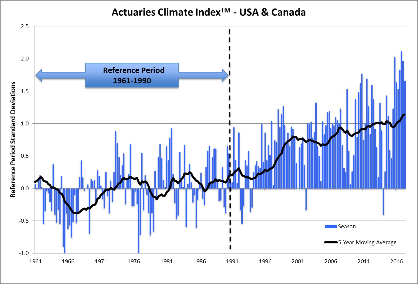
• Climate should be defined over long periods since there are always short-term fluctuations, but in more recent years, fluctuations have been more frequently up than down.
• The Actuaries Climate Index methodology uses a 30-year reference period of 1961 to 1990, and over that period, the average index is zero. Color-coded monthly or seasonal values display a quantified measure of changes in riskiness for the index and each of its six components.
• The five-year moving average, which smooths out the monthly and seasonal fluctuations, has slowly risen as we move away from 1990.
• The user can observe that climate risks have multiple impacts and these vary by region and component, allowing for informative comparisons and analyses.
How are the Actuaries Climate Index values calculated?
• The Actuaries Climate Index is the sum of component values divided by the number of components (six), so each is given equal weight (the frequency of cold temperatures has been declining; it is subtracted when calculating the average to reflect the adverse impacts of this decline). Scrolling down the six screens will show the series of values for each component:
♦ Frequency of extreme high temperatures
♦ Frequency of extreme low temperatures
♦ Frequency of high winds
♦ Maximum amount of heavy precipitation
♦ Longest period of consecutive dry days in the last 12 months
♦ Change in sea level
• “Extreme” refers generally to values that are in the 90th or 10th percentile. Values are measured as anomalies, which in the Actuaries Climate Index context refers to the difference between a value in a given month or season and the value in the 1961—1990 reference period.
• More details are available in Component Definitions under the DATA menu.
Index values can be compared to the reference period
Technical illustration of the Standardization Process
• The calculation involves two steps:
• Step 1: Calculating the average for the month or the season and subtracting the mean calculated for the corresponding month or season over the 30-year reference period to measure the variance.
• Values for components are in different units: frequency, number of days, millimeters of rain, etc., therefore cannot be added directly. Standard deviations are a common measure of risk, so component values are converted to this measurement.
• Step 2: Dividing the difference by the standard deviation from the reference period converts component values into standardized values that can be added together because they are expressed in a common unit of measurement: units of standard deviation (SD).
• These values are referred to on the index website as standardized anomalies: the difference between the component value in the month or season at hand and its average value during the reference period, 1961—1990, divided by the standard deviation of that component’s values during the reference period for that month or season ((x – µ)/ σref).
How are the screens organized?
• A typical screen relates to the Actuaries Climate Index or a component for a region and shows the standardized monthly or seasonal values color coded plus a black continuous line for the five-year running average.
• The top screen is for the aggregate selected and sub-screens display components or sub-regions. Click on one of the sub-screens and it enlarges and moves to the top.
• There are 15 screens displaying the Actuaries Climate Index for 12 regions plus the continental U.S., Canada, and both countries. For each of them there is a series of six screens covering the components.
• In total there are over 100 screens. Access them by selecting Regional Graphs or Component Graphs under the EXPLORE menu and using the drop-down menus.
Sample screen for the U.S. and Canada combined with the Actuaries Climate Index and a few regions
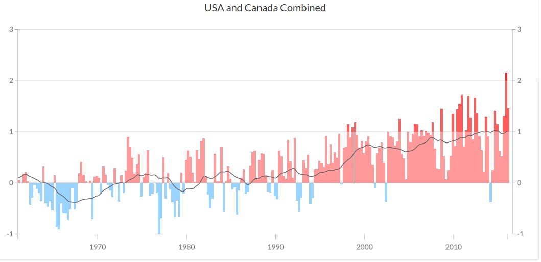
Note that the Actuaries Climate Index for the U.S. and Canada is not a weighted average of Canadian and U.S. indices. Standard deviations need to be calculated over the complete set of data for the location selected. The set of data for the U.S. and Canada is larger than either the U.S. or Canada and consequently generates lower standard deviations. A similar comment applies to a group of regions. A lower divisor results in higher standardized anomalies. Similarly, the index for Canada or the U.S. is not the weighted average of their regions.
Suggested exploration if this is your first visit
1) Read the “Executive Summary” using the link under the ABOUT menu.
2) Start with the U.S. and Canada and the aggregate index and then scroll down to compare the continental U.S. with Canada and the 12 regions by selecting Regional Graphs under the EXPLORE menu.
3) Select Component Graphs under the EXPLORE menu to look at components for the U.S. and Canada or a selected region.
4) Select MAPS under the EXPLORE menu to see an animation of what has happened in all the regions, by season, since 1961. You can also select a component or totals for the U.S. and/or Canada for the animation.
5) After a quick tour of regions or components you may be motivated to read explanations in other sections of the website or come back to specific screens.
• More detailed methodological information is available in the Development & Design document under the ABOUT menu.
• Numerical examples are available in the Sample Calculations document under the ABOUT menu. It may be useful to consult the Sample Calculations document when you have a question about detailed index calculations for a particular component.
• Download data for further analysis under the DATA menu. For details, see the Data Downloads.
6) Comments and suggestions are welcome at info@actuariesclimateindex.org.
If unexpected results appear, type the appropriate keyword in the SEARCH function in the upper right corner of the website. You can also send an email to the address above.